Context & Challenge
Ed's "Common Rostering" simplifies user data management by syncing it across educational systems through automated uploads. However, integrating the "manage additional staff" feature into the existing bulk roster import wizard posed significant usability challenges.
The wizard was already complex, with accessibility issues, unclear language, and lengthy modals.
Additionally, the system had to handle data overload from APIs, which required effective filtering of user roles and titles. The tight "Back-to-School" deadlines further limited our ability to iterate on the design. Our challenge was to seamlessly integrate the new staff management and role assignment features while enhancing usability within these constraints.

Milestones for the project
Understanding the Problem
The project began by collaborating with the product owner to define requirements for a new feature to manage additional staff within the existing bulk import process (Common rostering).
Our goal was to create a user-friendly solution that made role management easier and minimised errors. We identified key pain points, such as the time-consuming manual process and tables that were difficult to use, especially for those with accessibility needs.

Inital project user story
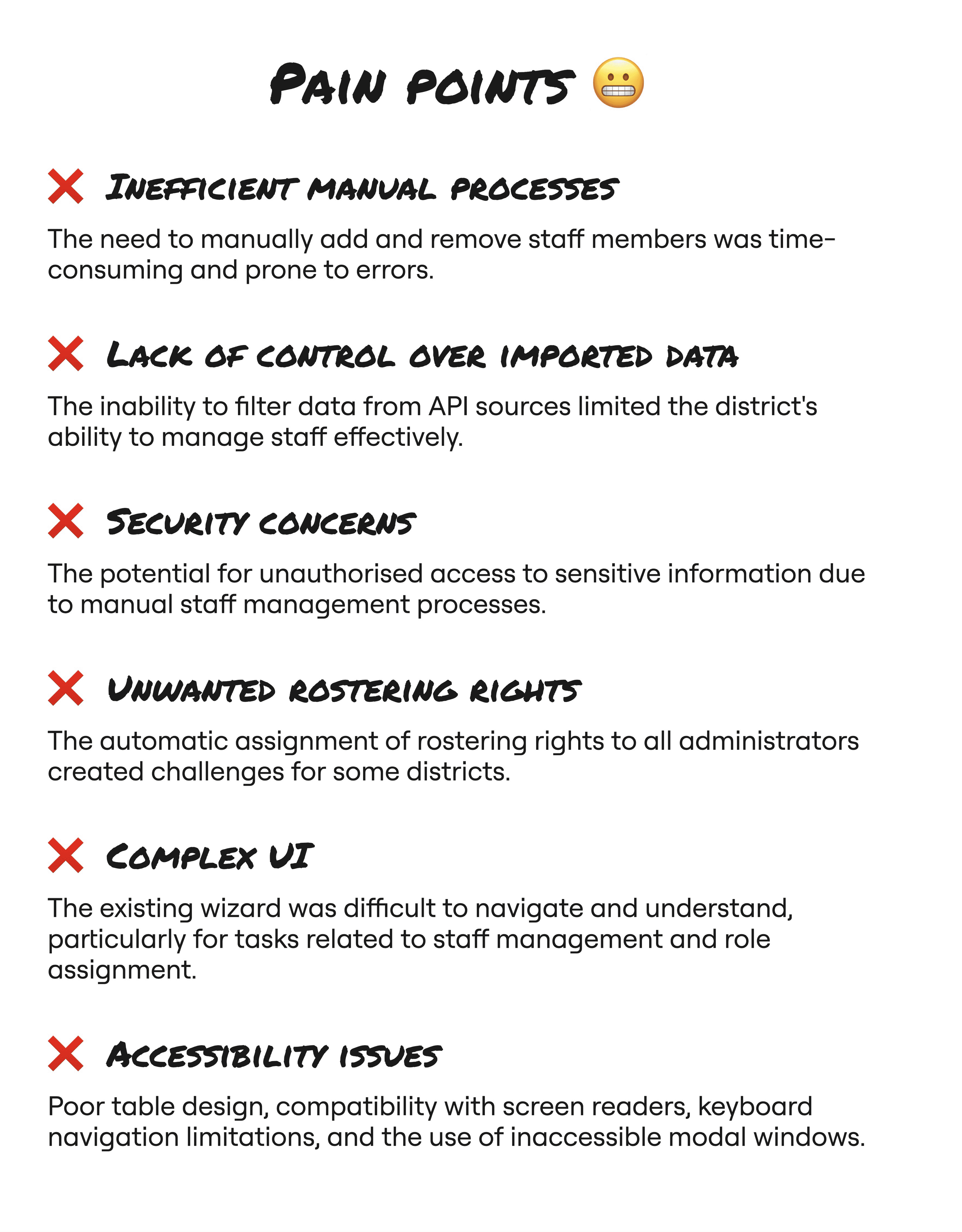
Pain points identified during the initial project research
Brainstorming & Refining
We held collaborative sessions with the design, product, and development teams to brainstorm potential solutions for the role assignment feature. This included exploring search and filtering options, sketching out screen flows, and considering different ways to present role information within table and modal formats.
Close collaboration with our accessibility expert ensured flows and components used were inclusive and catered to users with impairments.
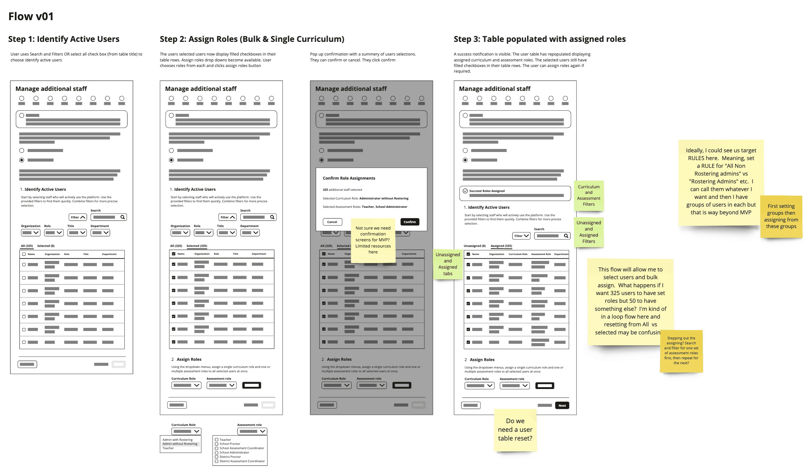
Wireframe sketches reviewed in collaboration sessions
Iterative Design & Testing
Low-fidelity wireframes were created to visualise the user flows for assigning and removing staff roles. Multiple rounds of feedback from stakeholders, led to the development of high-fidelity designs in Figma.
Alignment with the Ed platform's design system and pattern usage was maintained throughout, ensuring consistency and efficient updates.
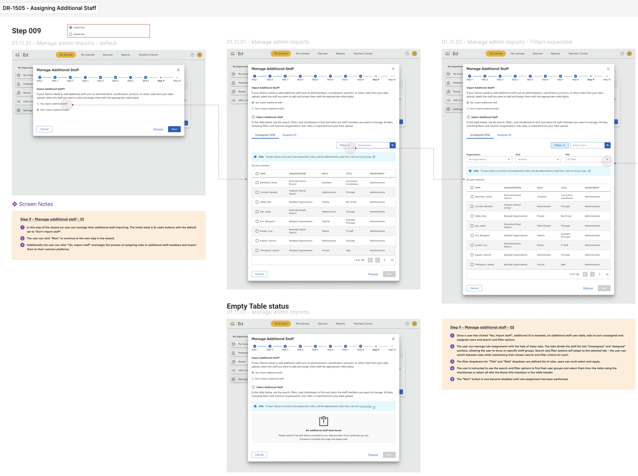
High-fidelity Figma screens
Usability testing with target users evaluated the effectiveness of the high-fidelity designs. Feedback from these sessions informed further refinements to meet user needs and expectations more effectively.

UX research user testing
Final Design & Development
Using insights from user testing, the final designs were refined and implemented in Figma. Accessibility annotations were added to the designs and collaborative reviews were scheduled with both the accessibility champion and the design system team to conduct thorough evaluations.
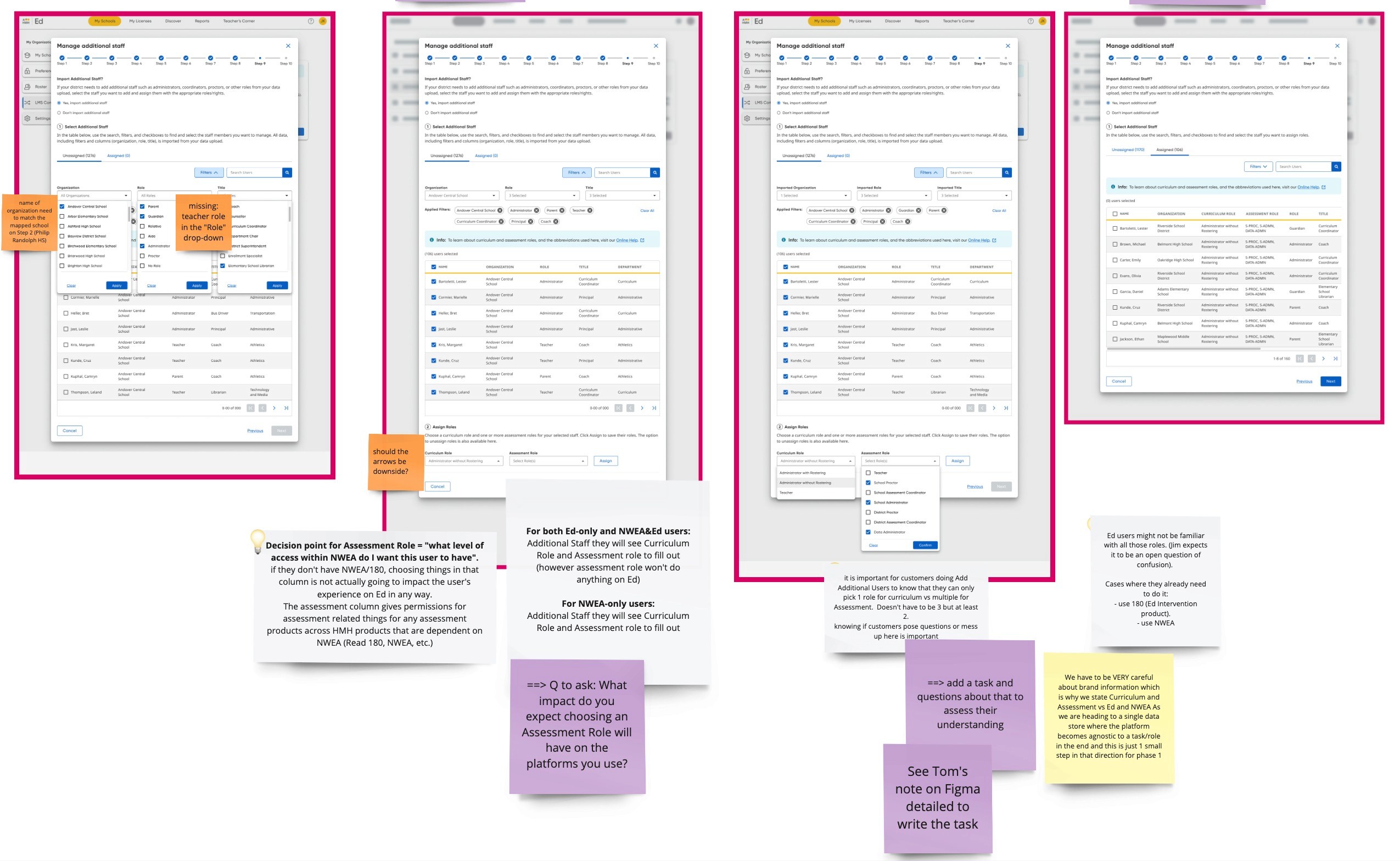
User test analysis
Once the design was approved, the development phase began, with the design translated into the final product. To maintain quality, design QA sessions were conducted in a local testing environment, any discrepancies identified during these sessions were logged as bugs and addressed through further development.
Working incrementally across sprints, the team aligned with the "Back to School" deadline, ensuring the timely delivery of the new feature.

Live screen design QA session notes
Project Impact & Lessons
The project successfully accomplished the additional staff task assignment for administrator users. This streamlined process led to a reduction in manual tasks and errors, enhancing overall user satisfaction.
User testing brought in positive feedback, with participants praising the efficiency and clarity of the new feature.
Looking ahead, post-launch analytics and ongoing user feedback will be crucial for understanding how this feature performs over time. These insights will help us continue improving the platform's user experience and adding value for our customers.
The feature in local testing environment